The adage “don’t judge a book by its cover” might hold true for some things, but when it comes to food packaging, first impressions matter more than we like to think. The colours we choose for our products can significantly influence consumer perception, driving purchasing decisions and shaping brand identity.
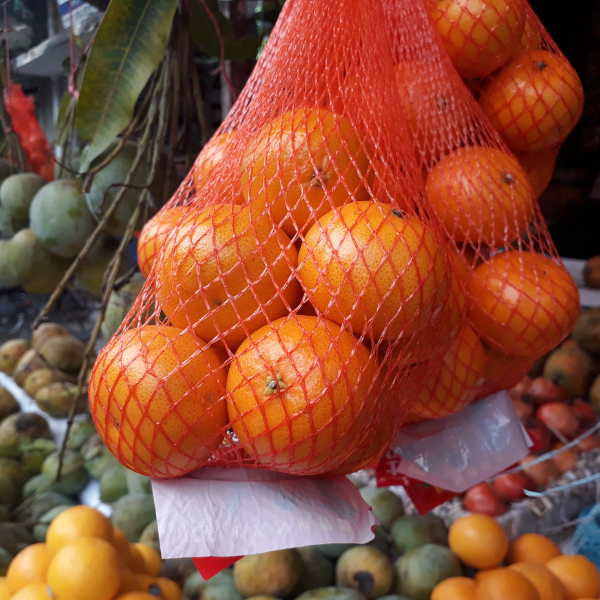
Have you ever wondered why oranges are often packed in red nets?
Which orange looks more attractive in the image below?

These oranges are actually identical, but most people will choose the left orange as looking for appealing or attractive. This example can be explained by the Munker-White illusion – an optical phenomenon that demonstrates how the perception of colour can be significantly influenced by surrounding colours. The illusion occurs when bands of colour are juxtaposed with contrasting stripes, leading to a perceived shift in the lightness or hue of the colours involved.
The illusion is based on the Bezold effect, which states that a colour’s appearance can change depending on the colours surrounding it. So in this case, the overlapping red stripes tricks our minds to make the orange appear brighter and more vivid.
The Munker-White illusion is not only a fascinating subject for visual perception studies but also has direct implications in food and beverage packaging and brand design.
Colour associations and emotional responses
Colour psychology is another fascinating field that delves into the emotional and behavioral responses evoked by different hues. In food and beverage packaging, colour plays a pivotal role in communicating product attributes and influencing consumer choices. Let’s take a look at some of the more commonly use colour associations and real-life examples:
Red: Often associated with energy, excitement, and appetite, red is a popular choice especially for fast food chains. It can stimulate impulse purchases and convey a sense of urgency. However, overuse of red can also evoke feelings of aggression or danger, so it’s essential to use it judiciously.


Orange: Evoking warmth, enthusiasm, and creativity, orange is often used to promote products that are perceived as healthy and natural. It can also stimulate appetite and create a sense of fun and excitement.


Yellow: Associated with happiness, optimism, and energy, yellow is often used to grab attention and create a sense of urgency. It can also stimulate appetite and enhance the perception of sweetness.


Green: Symbolising freshness, health, and nature, green is widely used in food packaging to convey natural and organic attributes. It can also evoke feelings of calm and relaxation.


Blue: Often associated with trust, reliability, and cleanliness, blue is frequently used in food packaging to convey a sense of purity and freshness. However, it can also suppress appetite, so it’s important to use it carefully.


While these general colour associations provide a foundation, the effectiveness of colour in food packaging depends on various factors, including cultural nuances, target audience, and product positioning. Successful packaging design requires a nuanced understanding of colour psychology and the ability to create visually compelling and emotionally resonant packaging that aligns with brand identity.
By carefully selecting and combining colours, food brands can effectively communicate product attributes, evoke desired emotions, and ultimately drive consumer purchasing decisions.
At inewtrition, we’re committed to understanding and anticipating the needs of consumers with in depth research and real-time analysis. Interested in exploring how inewtrition can support your product offerings? Book a free consultation with us today.


